
Neither option is universally correct. The best choice depends on your kitchen’s size, natural light, ceiling height, and desired style. Lighter cabinets against darker walls create a grounded, cozy feel and work well in larger kitchens with good light. Darker cabinets against lighter walls make cabinets the focal point and suit smaller or dimly lit kitchens that need brightness. Most designers recommend a contrast of two to three shades between cabinets and walls rather than matching them exactly. The relationship between these surfaces, along with countertops, backsplash, and flooring, determines whether your kitchen feels balanced or disjointed.
When Lighter Cabinets Work Best
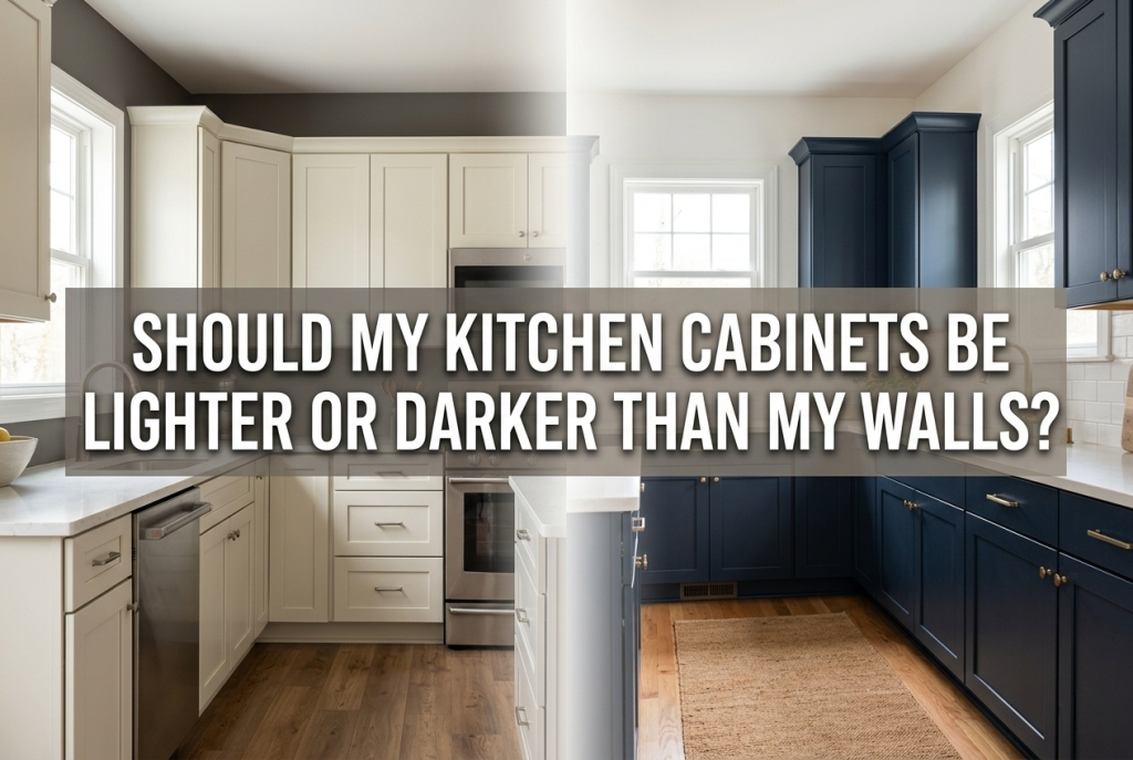
Light cabinets against darker walls suit specific kitchen conditions.
Large kitchens benefit from this approach. Darker walls contain the space and prevent it from feeling cavernous or cold. The lighter cabinets prevent the room from becoming too heavy.
Kitchens with abundant natural light handle darker walls without feeling dim. Sunlight balances the deeper wall tones and keeps the space feeling open.
Traditional and farmhouse styles often use this combination. White or cream cabinets against warm gray, sage green, or soft blue walls create classic appeal.
Open floor plans work well with this approach. Darker walls help define the kitchen zone within a larger living space while light cabinets maintain airiness.
For inspiration on balancing traditional elements with modern functionality, exploring modern farmhouse architecture shows how this contrast creates warmth without darkness.
When Darker Cabinets Work Best
Dark cabinets against lighter walls suit different conditions.
Small kitchens benefit from light walls that expand the perceived space. Dark lower cabinets grounded by light upper walls prevent the room from feeling cramped.
Kitchens with limited natural light need lighter walls to maximize brightness. Dark cabinets work as accents rather than dominating surfaces.
Contemporary and modern styles often embrace this contrast. Navy, charcoal, or black cabinets against white or pale gray walls create dramatic, sophisticated spaces.
Two-tone kitchens use this principle effectively. Dark lower cabinets with light upper cabinets and walls create visual interest while maintaining brightness.
Making darker cabinets the focal point draws attention to quality cabinetry and hardware as design investments worth showcasing.
The Role of Contrast
Contrast between cabinets and walls matters more than which is lighter or darker.
Two to three shades of difference creates visual separation without jarring contrast. Matching cabinets and walls exactly makes both disappear and flattens the space.
Low contrast creates calm, monochromatic spaces. All-white or all-cream kitchens feel serene but require texture variation to avoid flatness.
High contrast creates drama and energy. Dark cabinets against white walls or vice versa demands careful balance with neutral counters and flooring.
The backsplash bridges cabinets and walls visually. Kitchen backsplash tiles that incorporate both cabinet and wall tones unify the color scheme and smooth transitions between surfaces.
Consider Your Kitchen’s Light
Natural light changes how colors appear and determines what your kitchen can handle.
North-facing kitchens receive cool, indirect light. These spaces benefit from warm-toned cabinets or walls to counteract the bluish light. Avoid cool grays that will feel colder.
South-facing kitchens receive warm, abundant light. These spaces handle darker cabinets and walls without feeling dim. Cool tones work well here.
East-facing kitchens receive warm morning light that shifts cooler through the day. Neutral tones that adapt to changing light work best.
West-facing kitchens receive intense afternoon light. Darker elements help absorb harsh light rather than reflecting glare.
Test paint and cabinet samples in your specific kitchen at different times of day before committing. Colors shift dramatically between morning, afternoon, and artificial evening light.
Consider Your Ceiling Height
Vertical proportions affect whether light or dark cabinets feel balanced.
Standard 8-foot ceilings work with either approach but benefit from lighter upper cabinets or walls that draw the eye upward.
Low ceilings feel taller with light upper walls and cabinets. Avoid dark colors at ceiling level that compress the space visually.
High ceilings can handle darker upper surfaces without feeling oppressive. Dark walls with lighter cabinets work particularly well in tall spaces.
Upper cabinet color affects perceived height more than lower cabinet color. Light uppers with dark lowers makes ceilings feel higher regardless of wall color.
Style Considerations
Design style influences which approach feels appropriate.
Traditional kitchens typically use lighter cabinets with colored walls. Cream or white cabinets against sage, blue, or warm gray walls feel classic.
Modern kitchens often reverse this. Dark or bold cabinet colors against white or pale walls create the clean contrast contemporary design favors.
Transitional kitchens blend both approaches. Two-tone cabinets or medium-toned wood with neutral walls bridge traditional warmth with modern simplicity.
Mineral Tiles (one of America’s top-selling tile brands) offers tiles in both bold and neutral tones that help balance cabinet and wall color choices regardless of style direction.
Conclusion
Whether kitchen cabinets should be lighter or darker than walls depends on your specific space. Lighter cabinets with darker walls suit large, well-lit kitchens seeking warmth and definition. Darker cabinets with lighter walls suit smaller or dimly lit kitchens needing brightness. Contrast of two to three shades creates visual interest regardless of which is lighter. Natural light, ceiling height, and design style all influence the best choice. Test samples in your actual kitchen before deciding, and consider how backsplash, counters, and flooring complete the relationship between cabinets and walls.
FAQs
Do dark cabinets make a kitchen look smaller?
Dark cabinets can make kitchens feel smaller if used extensively. Balance dark lower cabinets with light upper cabinets and walls. Good lighting and reflective surfaces help counteract any shrinking effect.
What is the 60-30-10 rule for kitchen colors?
The 60-30-10 rule suggests 60% dominant color (walls and large surfaces), 30% secondary color (cabinets), and 10% accent color (backsplash, hardware, decor). This ratio creates balanced, professional-looking kitchens.